The brief
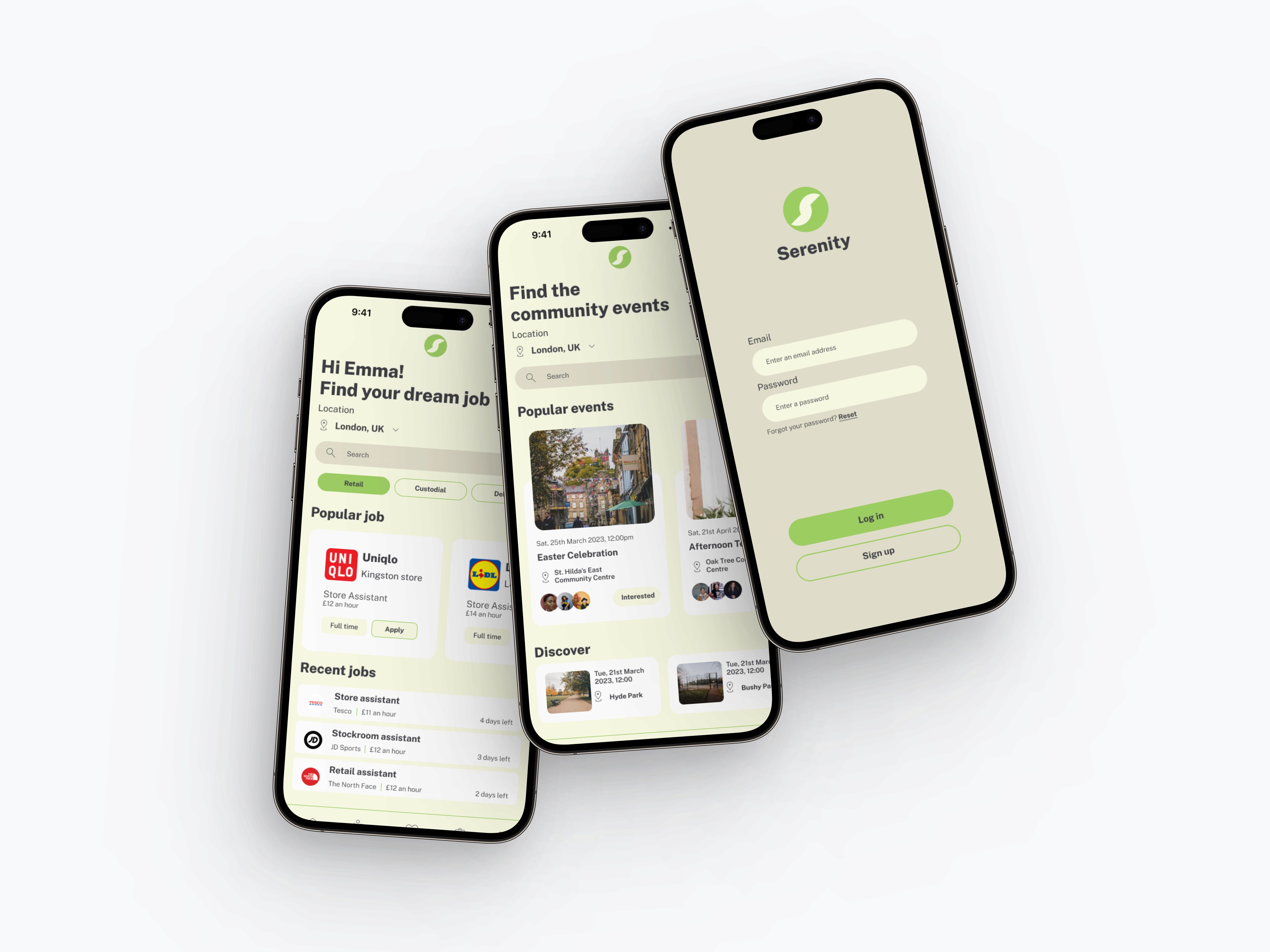
Creating an app that aims to reduce pressures associated with homelessness. Proposing a user journey that supports and educates users on relevant material that can support someone at risk of becoming homeless.
UX/UI designer
What is homelessness?
Homelessness is a condition where an individual or household lacks a stable, safe, and adequate place to live. This can be the result of a variety of factors, including:
Poverty
Lack of affordable housing
Job loss
Mental illness
Addiction
Domestic violence.
Over the past 10 years, homelessness has been a growing issue & here in the UK, the number of people sleeping rough has more than doubled since 2010.
The COVID-19 pandemic has had a significant impact on homelessness in the UK. The economic impact of the pandemic has led to an increase in unemployment, which has in turn increased the number of people at risk of homelessness. The pandemic has also made it more difficult for homeless people to access essential services, such as food banks and healthcare, and has led to the closure of many day centres and shelters.
In response to the pandemic, the UK government has taken some measures to address homelessness, such as providing emergency funding to local councils and setting up temporary accommodation for homeless people. However, there is still a long way to go to address the underlying issues of homelessness in the UK, and the impact of the pandemic has made this more challenging.
Problem statement
"I am at risk of homelessness and I need access to resources and community engagement to help me avoid this outcome. However, I am having trouble finding and connecting with these resources. I need a solution that can guide me, help me find jobs and provide me with the necessary information to help me through this difficult time."
Hypothesis
To solve the problem of homelessness among individuals in the UK, I am going to change the way they access and engage with resources and support services through the Serenity app, and the method I will follow is to provide a user-friendly platform that connects them to tailored resources, community engagement, and job opportunities.
My design process
Using the double diamond approach allowed me to understand users & their problems without assuming and from there I dived into exploring creative ways to solve their problems.
Discover - Talking to users
Define - What are the problem areas, what are they loving.
Develop - Ideas, sketching, wireframing, concepts, solution and discovery work
Deliver - Deliver final product shared with users
Research phase
Competitive Analysis
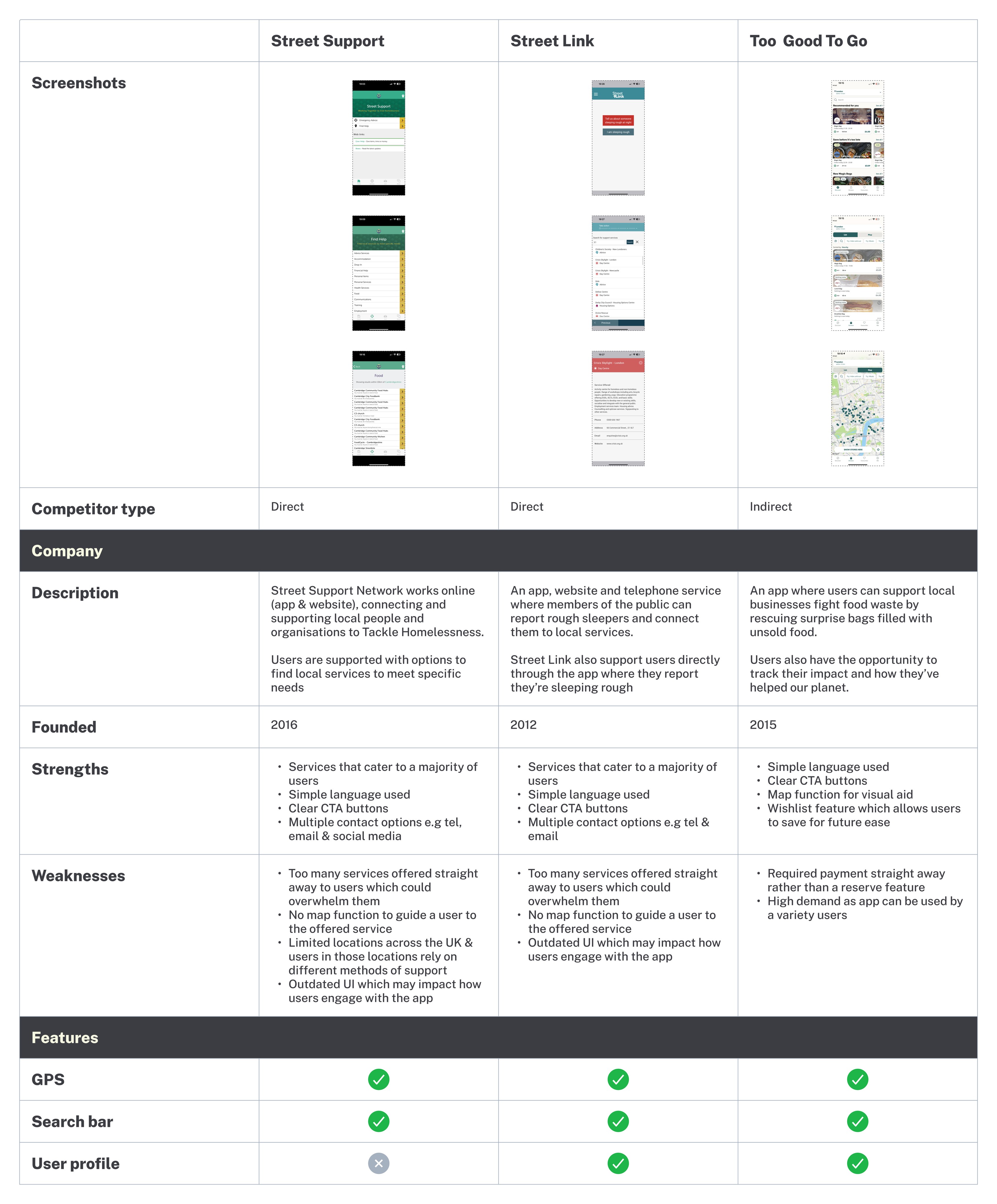
To begin my research phase I went into analysing competitors, this was a vital part of research and it gave me an insight into what features & services were available for users.
I reviewed 2 direct competitors, Street Support & Street Link, as well as Too Good To Go as my indirect competitor.
Insights:
Offering a wide range of services is good, but there should be a balance to avoid overwhelming users.
A map function would be helpful to guide users to the services they need.
It's important to consider the different methods of support that users in different locations may rely on.
Keeping the language simple and using clear CTA buttons can help users engage with the app more effectively.
Providing multiple contact options can increase the accessibility of the app.
An updated UI can improve the user experience and increase engagement with the app.
Red Route Analysis
Collecting primary research from users at risk of homelessness was difficult so I reached out to trusted professionals at Citizens Advice Bureau.
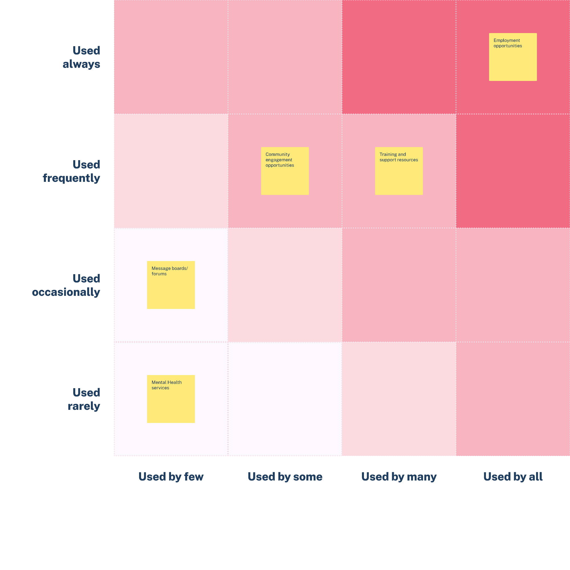
I had 7 participants in total and I carried out a red route analysis with a group of participants to gain an understanding of their experience for what users need.
Insights:
During our red route analysis session with professionals, I gained some valuable insights into how users would interact with our platform. One of the most significant findings was that the 'Employment opportunities' feature is something users find incredibly important. However, currently, their frustration is accessing through a third-party app or website rather than within support apps.
This indicates that offering employment opportunities is a crucial aspect of our platform. By providing a streamlined way for users to access employment opportunities, we can help them achieve their goals and improve their overall experience.
Secondary research:
Due to the difficulty of speaking to users directly, I gathered secondary research to further support my design decisions and ensure that I remained user focused.
Along with speaking to professionals, I reviewed articles with personal accounts of users at risk of homelessness to understand their point of view.
"I've tried using some apps to find a place to stay, but they're not very helpful. Either they don't have any available options or the places they suggest are really far away from where I need to be." (The Big Issue)
"The process for getting help can be really confusing and overwhelming. I've had to fill out so many forms and talk to so many different people, it's hard to keep track of it all." (Shelter)
"I've had some bad experiences with charities who don't treat me with respect or dignity. Some of them seem to think they're doing me a favour by providing help, rather than recognising that it's their responsibility as a society to support those in need." (Crisis UK)
Secondary research to me was incredibly valuable and gave me a true understanding of users' thoughts and what I can do to implement and consider within my designs.
User interviews
From the secondary research and the insights from the professionals I put together some interview questions to try & understand the user pain points that users at risk of homelessness were sharing with them.
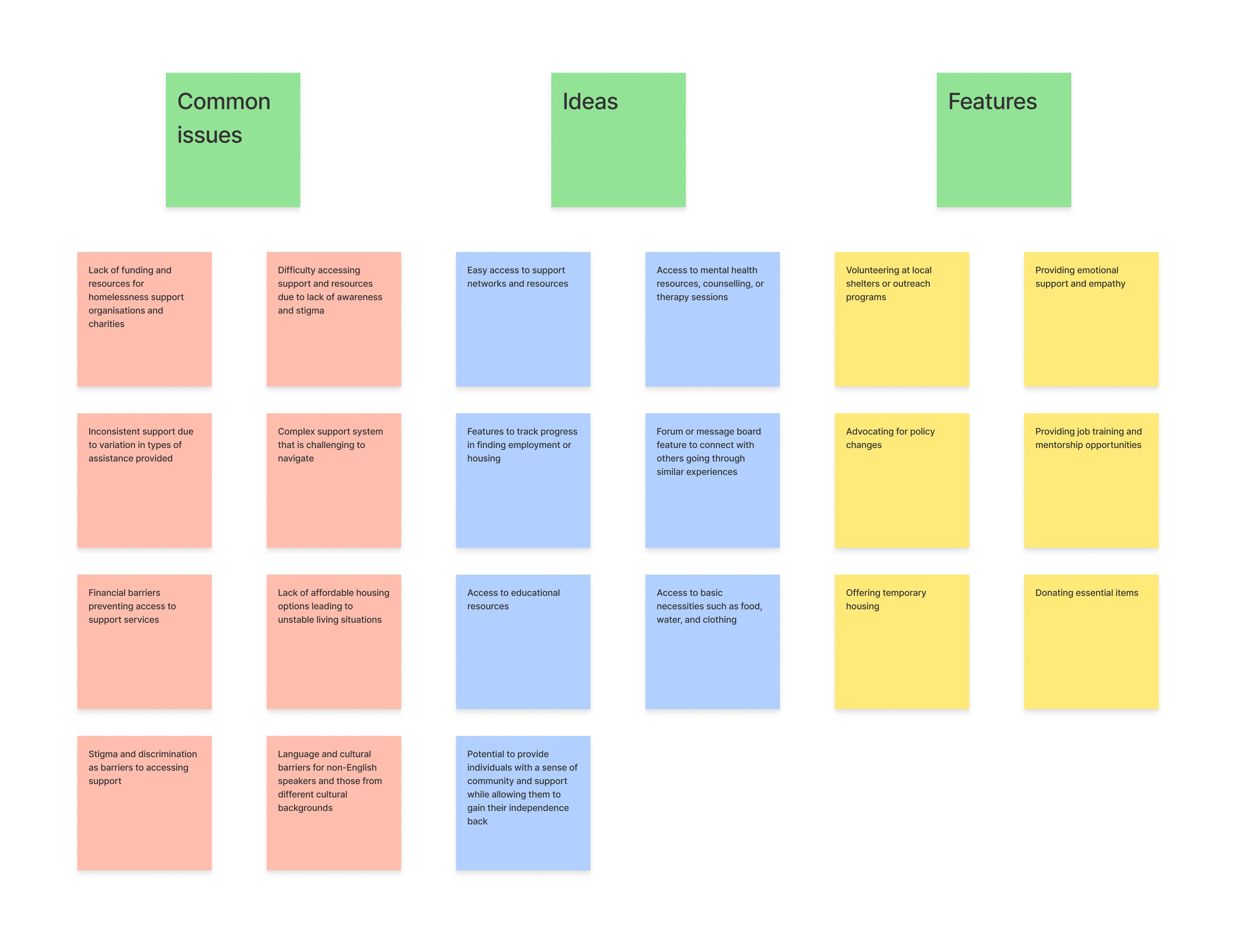
I gained a lot of insight from the interviews and used an affinity map to help me make sense of the data. It also allowed me to group data points and ideas into categories, which then helped me to identify pain points, common themes, and opportunities.
Insights:
The affinity map highlights that there are common issues faced by individuals experiencing homelessness such as inconsistent support, complex support systems, financial barriers, lack of affordable housing, stigma and discrimination, and language barriers.
Ideas that emerged include easy access to support networks and resources, mental health resources, job and housing tracking features, forum or message board to connect with others, and access to basic necessities. Additionally, providing emotional support, advocating for policy changes, offering job training and mentorship opportunities, and providing temporary housing were identified as essential features.
The affinity map emphasises the need for multifaceted solutions that address the variety of challenges faced by individuals experiencing homelessness.
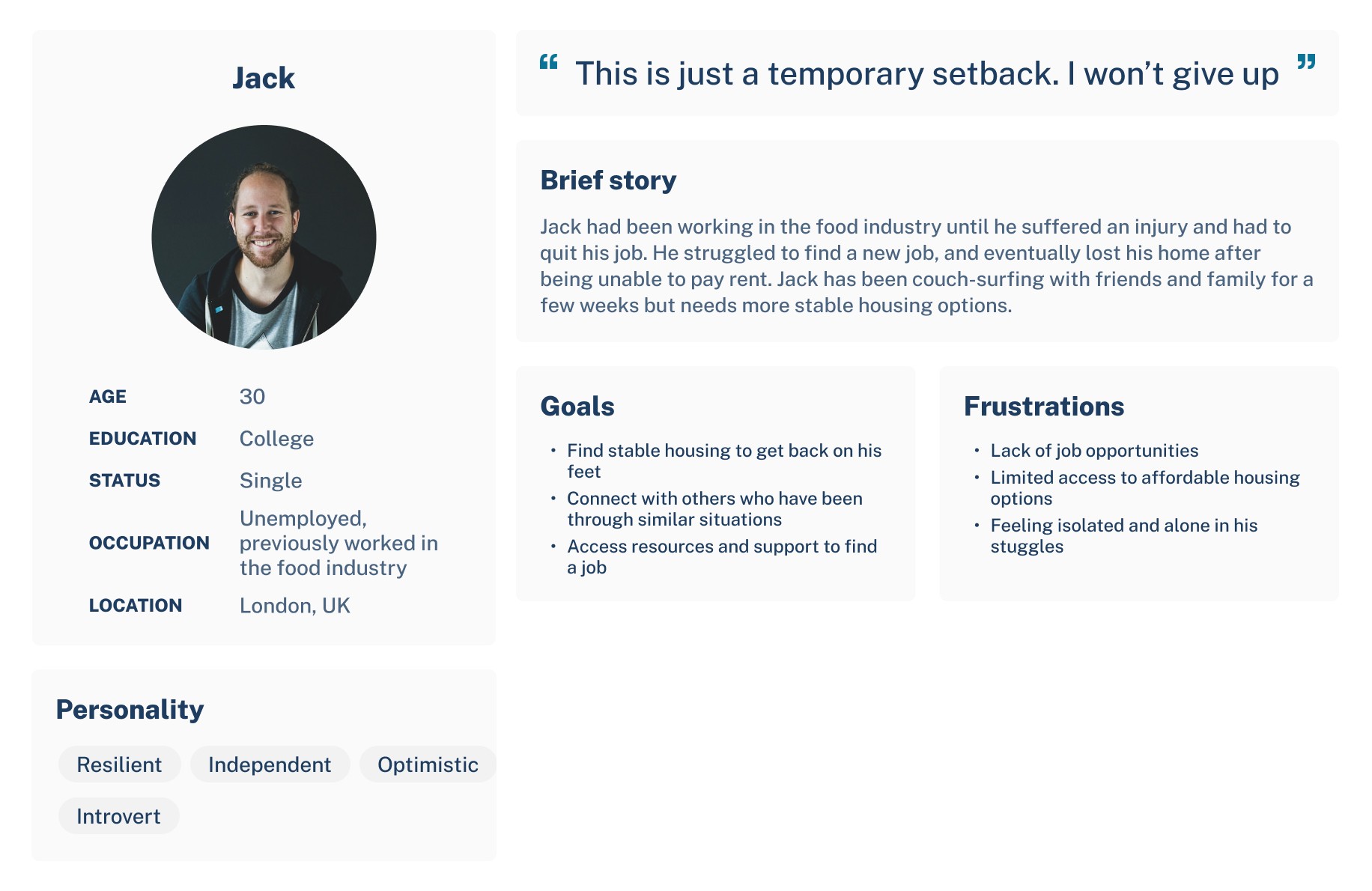
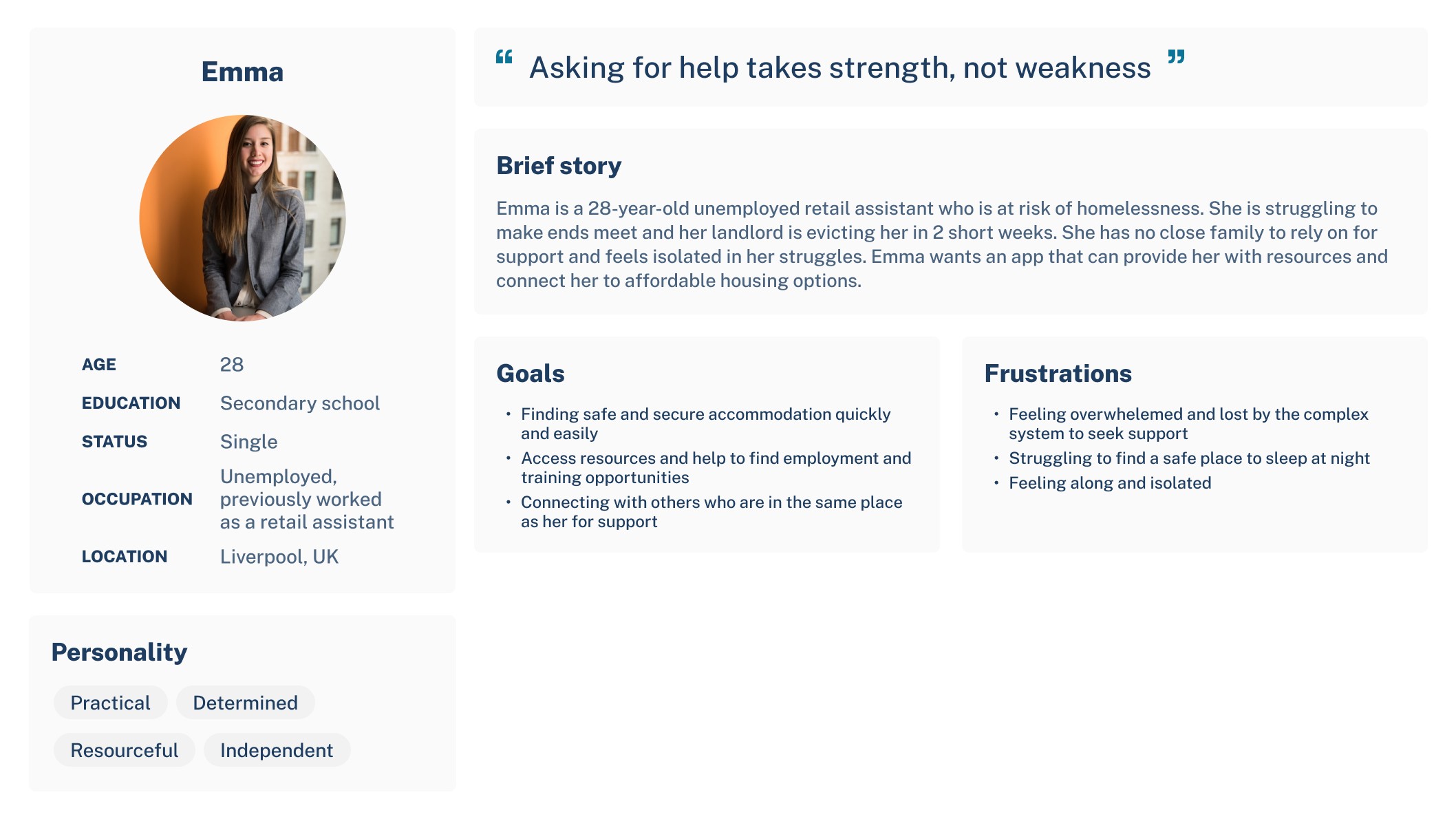
User personas
From my user research I created user personas that allowed me to design with the user at the forefront.
Ideation phase
Mindmapping
Following the research phase and as I was getting into developing, I quickly brainstormed all ideas I had.
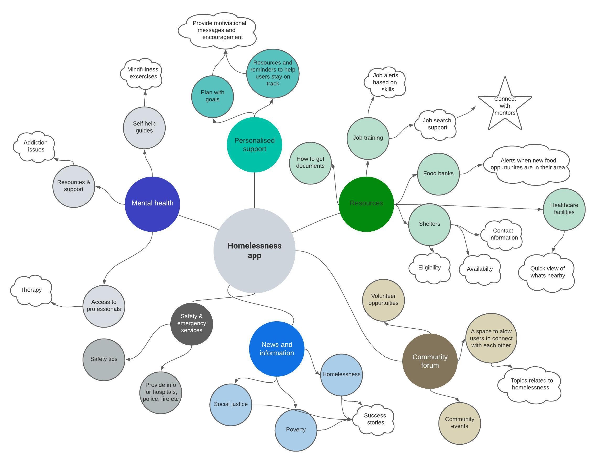
Overall, brainstorming allowed me to develop creatively and focus on user-centred designs.
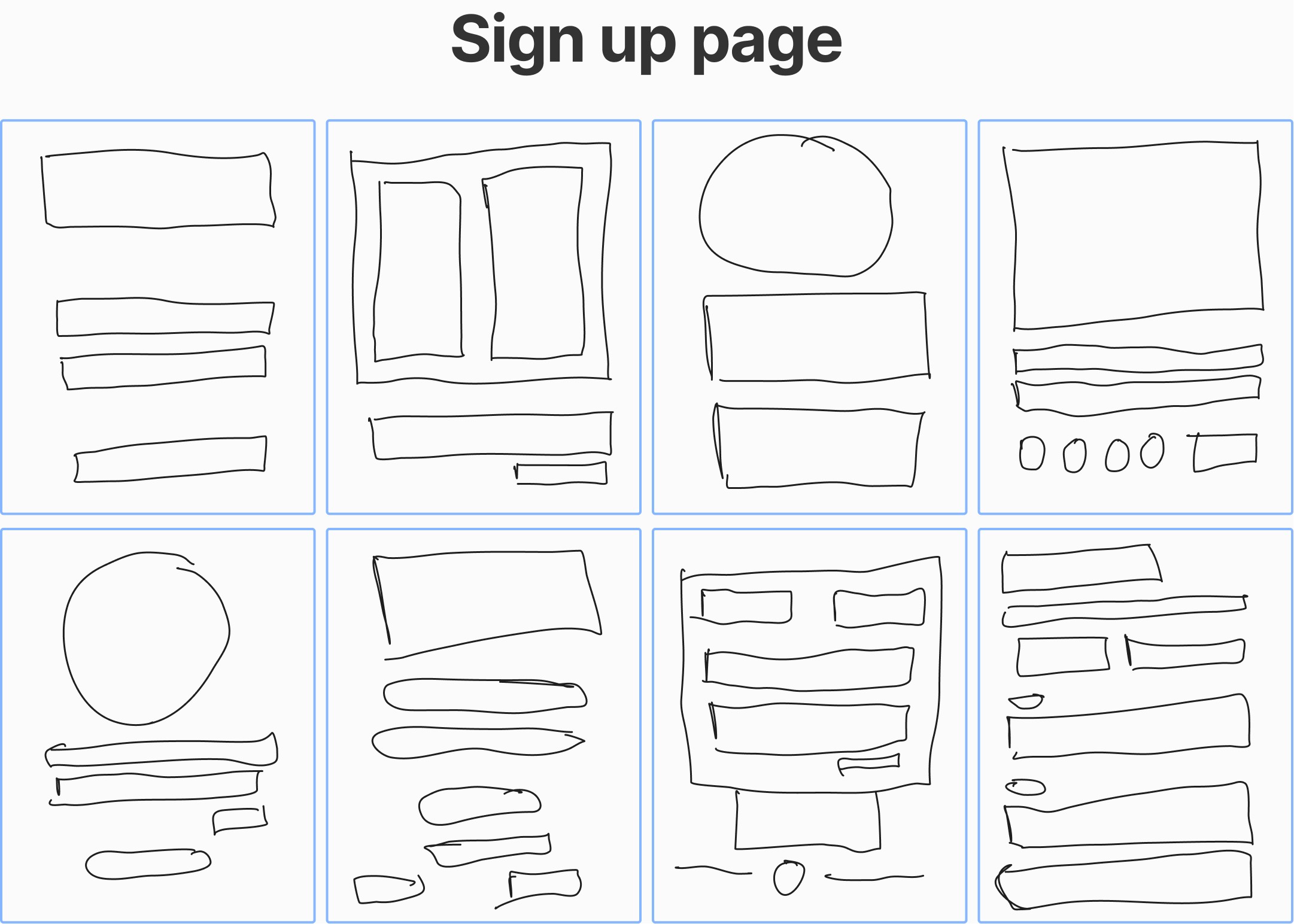
Crazy 8s
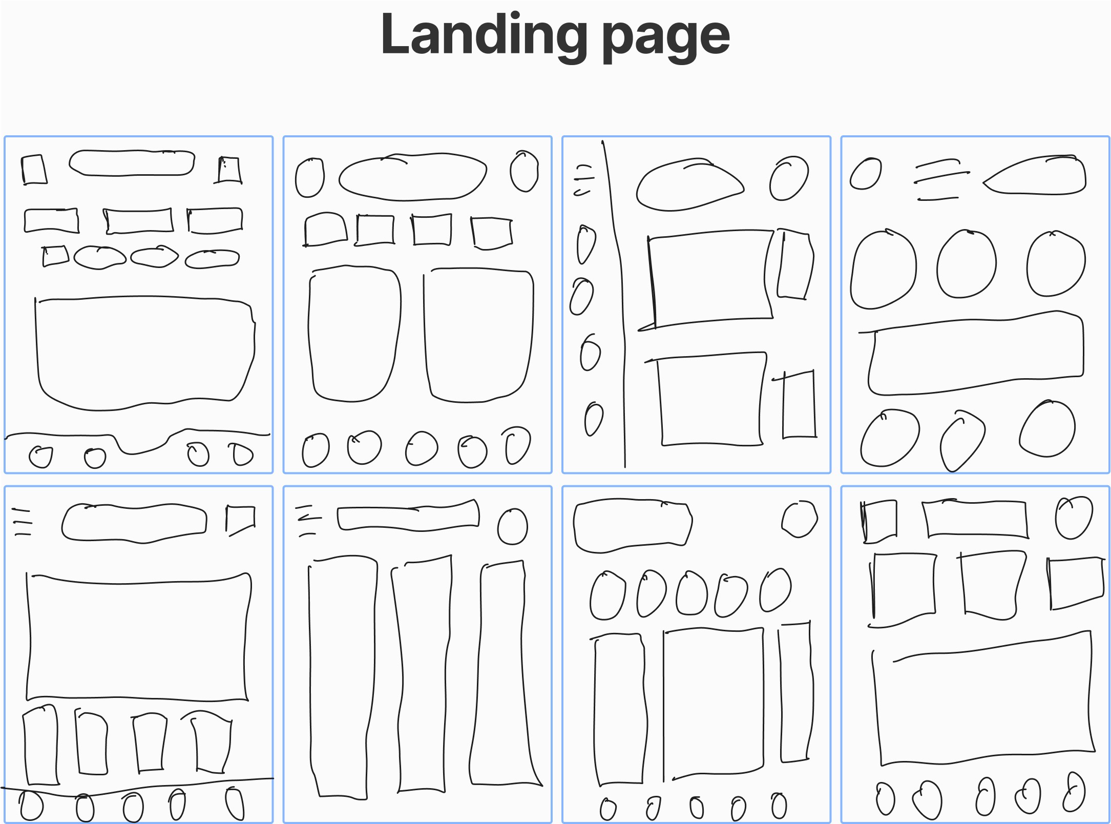
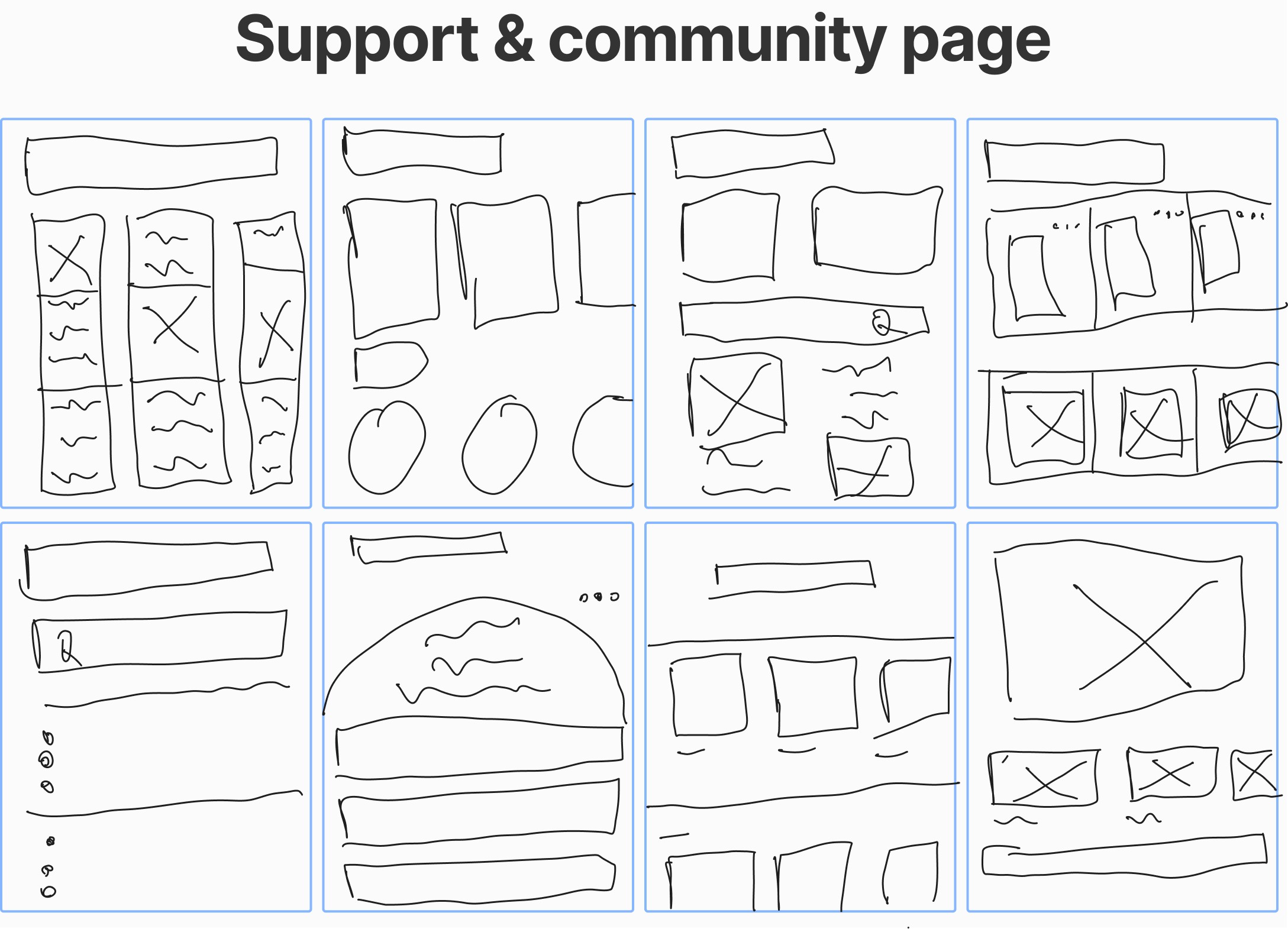
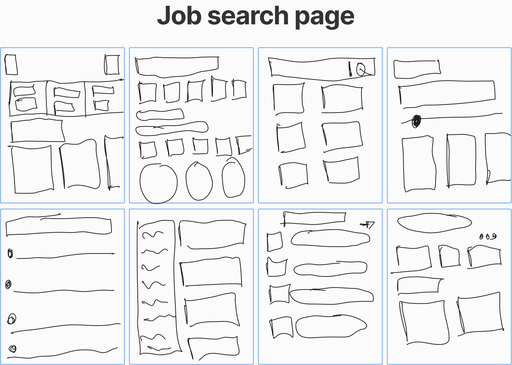
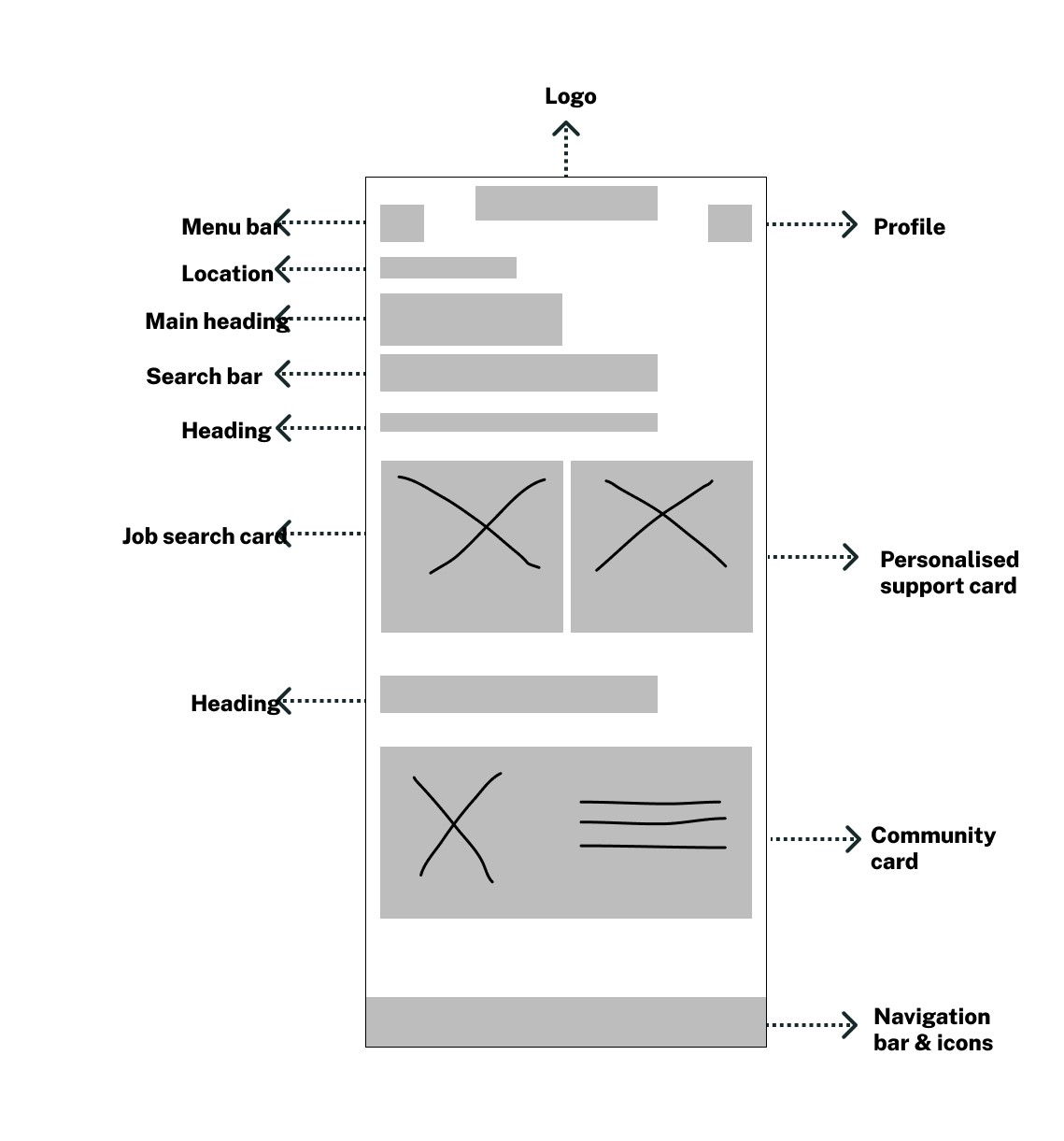
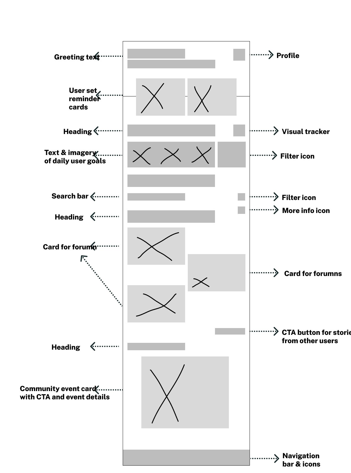
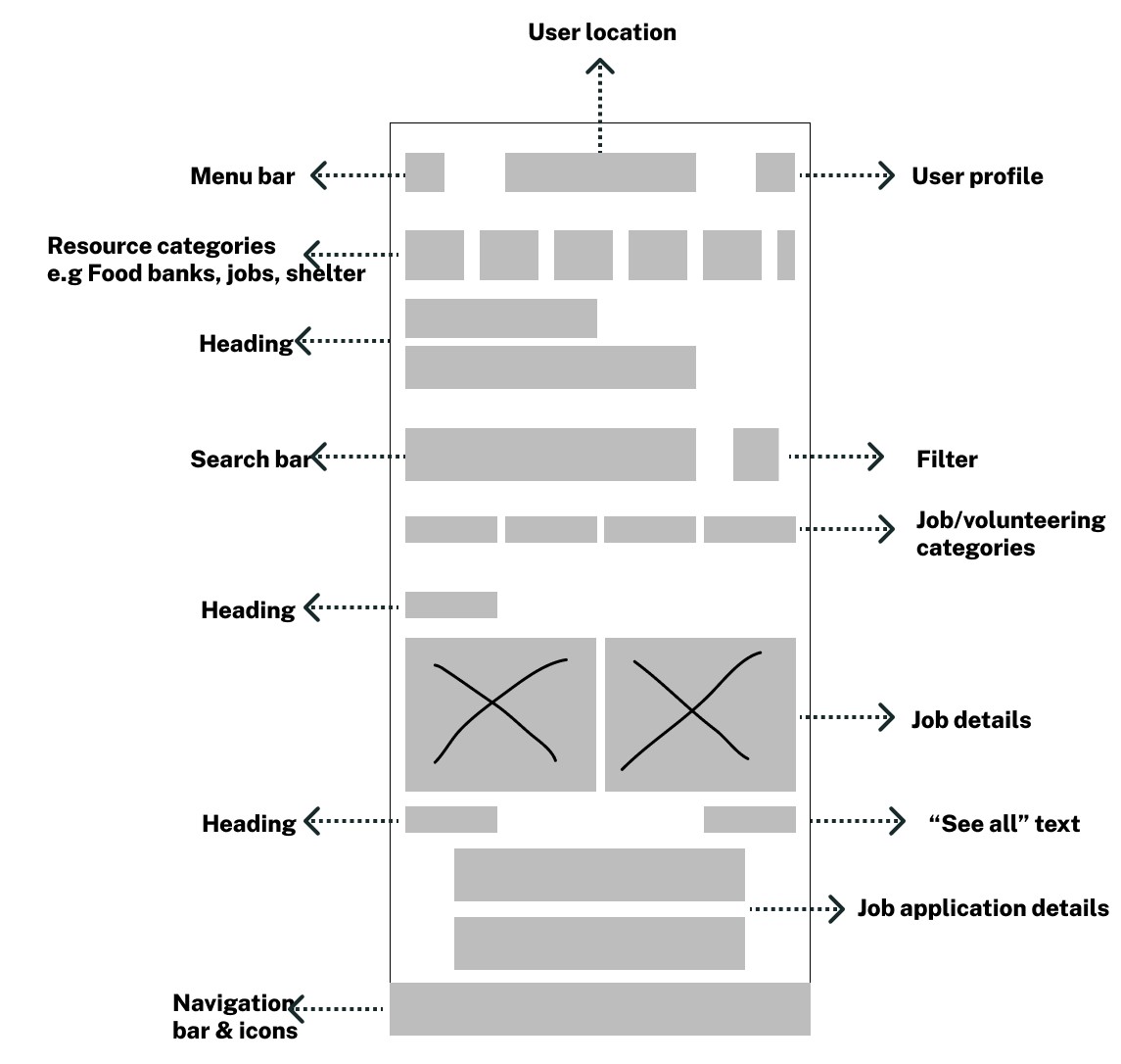
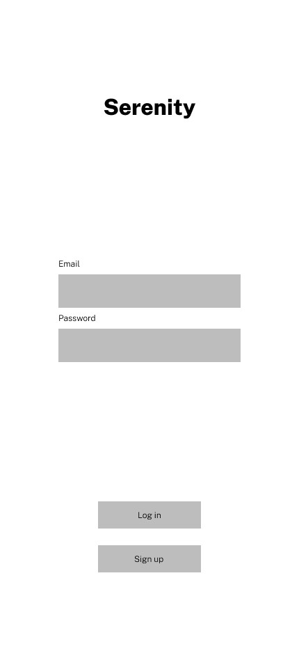
To me this was all about quick ideas and putting pencil to iPad and seeing what I could come up with in a short period of time. I did this for all 4 pages. The log in/sign up page, landing page, support & community page and jobs page.
Low fidelity wireframes
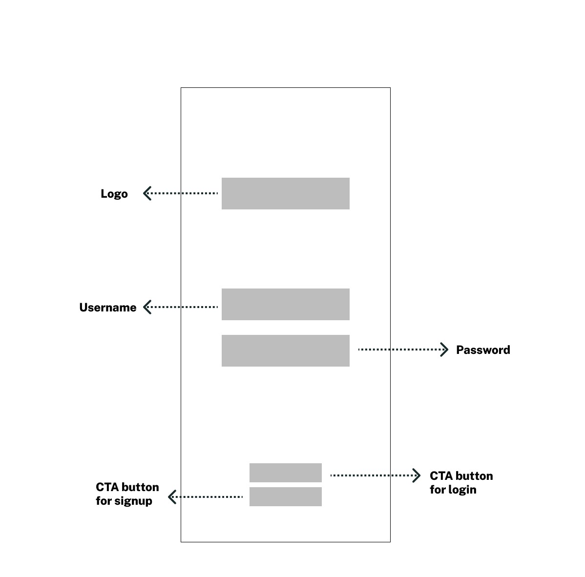
I sketched out my designs on my iPad using Invision. It was a great way for me to focus on the solution and map out the elements I wanted to prioritise in the redesign.
I shared the sketches with the participants and the feedback was to separate the support and community page to avoid overwhelming the users. This was implemented in the mid fidelity stage.
Sign up page:
Landing page:
Support & Community page:
Job search page:
Mid fidelity wireframes
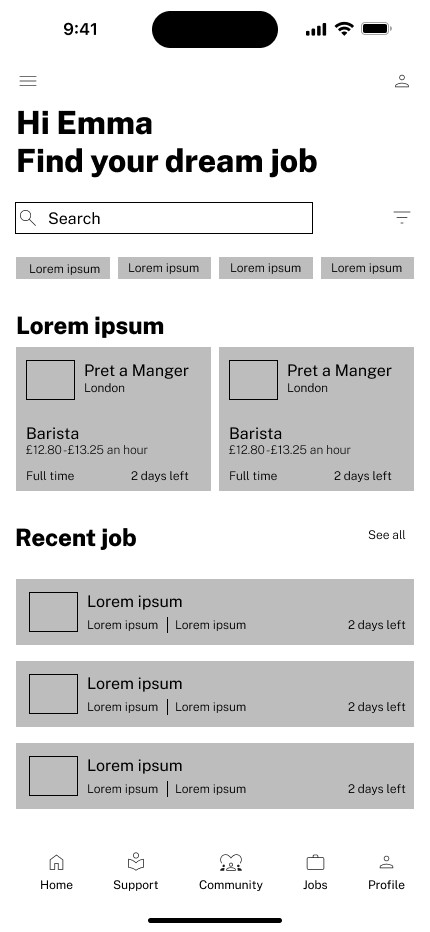
I created my mid fidelity wireframes in Figma. In comparison to my low fidelity there are more visual elements and structure. To ensure consistency, clarity, and accuracy across all screens, I used the iOS guidelines & at this point still no brand identity or colour however a mixture of placeholder text and real text was used to solidify the structure.
Sign up page:
Landing page:
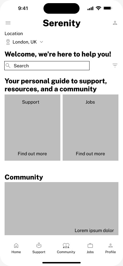
Support page:

Community page:
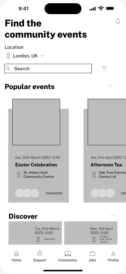
Jobs page:
High fidelity wireframes
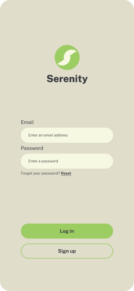
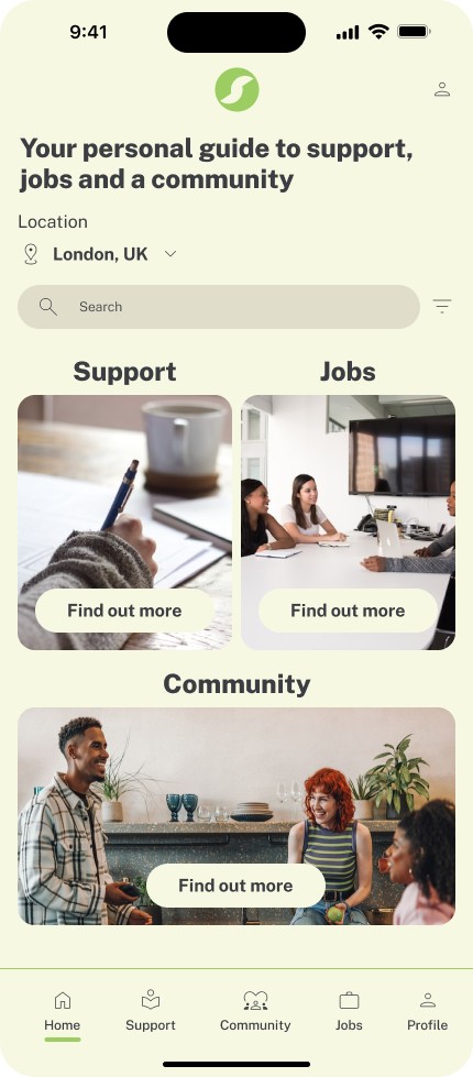
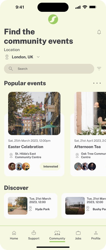
I built upon the first 2 wireframes to create the final product. From a UX perspective, the 5 frames provide a consistent and user-friendly experience for the users of the Serenity app.
Sign up page:
Landing page:
Support page:

Community page:
Jobs page:
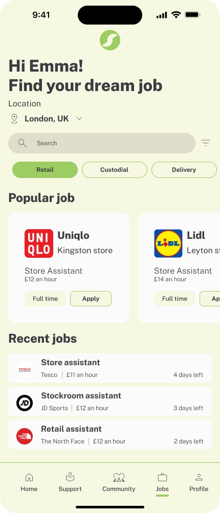
My designs also aim to address the issue of limited locations across the UK by making Serenity inclusive to all users across the country. Additionally, the updated UI addresses the issue of the outdated design of competitor apps, which could impact how users engage with the app.
Through these design decisions, I aimed to make the app more accessible and user-friendly for people facing the challenges of homelessness.
Style guide
When designing Serenity , I carefully considered the use of colours to enhance the user's experience. In my design, I chose to use the colour green for specific elements for several reasons.
Firstly, green is associated with nature, growth, and harmony, which can create a calming effect on users. This makes it a suitable colour for elements that need to convey a sense of balance and stability, such as navigation buttons & progress indicators.
Secondly, green is commonly used to convey success or positive actions, such as completing a task or achieving a goal. Therefore, I incorporated the colour green into my design to reinforce these positive actions and encourage users to continue using the app.
Overall, my decision to use the colour green in my design was intentional and aimed to improve the user's experience by creating a calming and positive atmosphere while using the app.

Design fundamentals
A breakdown of all the UX laws followed in my designs.
Jakob’s Law
With my redesign I kept this law in mind as users transfer expectations. I reviewed competitors (Street Support & Street Link) & kept it familiar to ensure smooth user experience.
Miller’s Law
This law explores the span of immediate memory for users, as a result I grouped content in a manageable format (company, job title & pay) to help users memorise, process and understand information easily.
Aesthetic-Usability Effect
Users often perceive aestheticist-ness as more usable. I’ve considered this and through the design high quality imagery has been used as well as, creating balance and alignment.
The Law of Proximity
The principle holds that if you are handling a group of data, all the data that we understand that correspond to the same group should be together. This is made clear by the boundaries within the design.Hick’s Law
Too much stimuli affects users journey with this in mind simplicity was important. To avoid elongating the user journey, I made sure to display only essential features and information on the designed screens.
Web Content Accessibility Guidelines (WCAG)
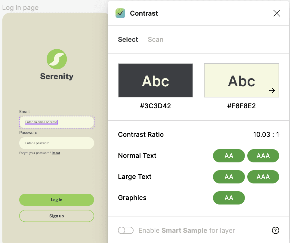
Within my design process accessibility was my top priority to ensure all users felt included. I used a Figma contrast plug in to ensure users with visual impairments could engage as shown below.
Conclusion
Overall, the Serenity app design project went well in terms of meeting the goals and objectives set for the project. The user-centred approach I took in designing the app helped me identify the key pain points and challenges users at risk of homelessness were facing. The high-fidelity designs reflect the simplicity and ease-of-use of the app, and ensure that users can easily navigate and access the services and support provided.
One of the challenges faced during the project was the difficulty of conducting primary research directly with users; however this allowed me to explore different methods and I relied on professional support and secondary research.
There is still room for improvement in the app design, particularly in incorporating a feature that allows users to provide feedback or share their experiences with the community which could help foster a sense of belonging and support.
In summary, the Serenity app project addresses the challenges faced by users at risk of homelessness in the UK.
Prototype
On a final note below is my interactive prototype, designed to deliver a user-friendly experience with intuitive navigation and interactive elements. The prototype offers users the benefit of efficient and seamless interaction, enabling them to complete tasks easily and effectively. By prioritizing the user experience, I aimed to create a product that satisfies users' needs while showcasing my skills in UX design
